| parkerpens.net |
| PARKERCOLLECTOR.COM |
1994—current |
||
But by 1990 the Parker "75" was closing in on its twentieth year, and it's high end cousin, the Parker Premier (that shared many finishes with the Parker "75") was soon to turn ten. Other high end pens, like the Classic, had been around since 1982 (even though it was slightly redesigned 1988 as the Parker "95"). Parker decided that it was time to retire the old work horses and launch a new top line fountain pen. During the 1980's Parker had relied heavily on the Jotter for the low end ball pen market and the Classic for the high end ball pen and roller ball pen market. By the late 1980’s Parker felt that they needed to revitalise the $10 to $100 gift market and commissioned Hollington Associates in London to design a completely new ball pen and pencil. As a result of this The Insignia was introduced in 1991. The principle designer of the pen being Geoff Hollington. |
Now Parker again contacted Geoff Hollington and asked him to come up with a fountain pen design that would be versatile and attractive enough to replace the Parker "75".
Hollington worked closely with Parker's engineers to make sure space was efficiently used and that writing performance, cap fit, pushbutton action for the ball pen version and so on were optimised. His long experience with different materials and the knowledge of the basic construction of the pen, ABS plastics, acrylics, brass, stainless steel, silver and gold made the cooperation work well.
|
|
 |
x
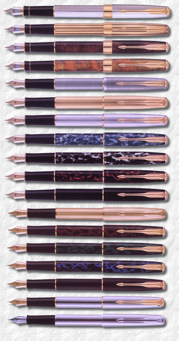
The 1994 Sonnets, from the top: |
— It always astonishes me how badly most pen products rate in these respects. We used to work and fight really hard to get a shape where the cap looked equally good on the front and back of the pen, where the step between cap and barrel was minimised or non-existent. In a product of this size, a tenth of a millimetre is worth worrying about! Geoff Hollington reveals. He explains that the Sonnet was intended to be ‘the classic Parker’, a truly timeless product, so he went for a really well proportioned cigar shape, clear but updated arrow clip, a generously sized nib and, from the engineers, state of the art writing performance. He of course later went on to design the price winning Parker "100" and the Frontier. The strategy was to offer the Sonnet in several designs, priced accordingly, so that one model could be offered in a wide price range. |
Two more laque designs were fitted with the two-tone solid gold and ruthenium nib: |
 |
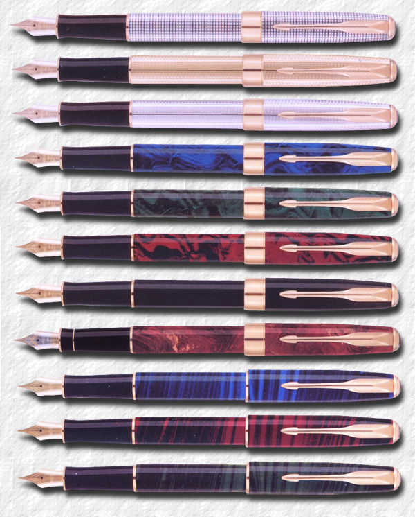
The Sonnets new in 1998: Cicelé, Cascade Gold, Cascade Silver, Premier Blue Laque, Premier Green Laque, Premier Red Laque, Premier Solid Black Laque, Chinese Laque Red, Deep Blue Laque, Red Laque and Green Laque. |
 Photography ©2012 by and courtesy of English Channel Collection. |
x
An unusual black laque Sonnet with a broad band and chrome trim. |
Four high end laque designs in black and coloured fire-like swirls were also offered with the solid gold nib, thin cap bands and 23K trim: |
The Sonnet Cicelé now had a broad gold band, as did the Cascade Gold and Cascade Silver Four new Laque designs with water-like swirl pattern were offered: They also had their lower priced alternatives with 23K goldplated stainless steel nibs and a thin cap band: Three Laques in a striped wood-like pattern: These replaced the Laque Indigo, Laque Moonbeam and Laque Firedance which were discontinued. The Chinese Laque Vision Foncé and the Chinese Laque Ambre were also discontinued and replaced with a new In 2001 the name Dimonite G was dropped and the gold plated pen was referred to only as 14K Gold plated. |
 |
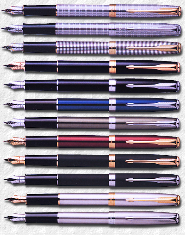
The 2003 Parker Sonnets: Cicelé, Tartan GT and ST, Laque Black GT and CT, Laque Ocean Blue, Laque Verdigris, Laque Ruby Red, Matte Black GT and CT, |
The Cicelé remained and two new top desings were introduced: The Laque black, Matte Black and Flighter models now all had a choice of trim: And three new Laque pens were introduced: This line-up remained until 2007, when a new design was offered: The Ciselé remained while the black laque models were renamed |
Collectors are constantly looking for the Sonnet Cicelé, Fougére and Athenes designs, which sometimes fetch twice as much as the laquer designs. Even though some other designs are in fact much rarer. The Sonnet has proved itself as a worthy successor to the Parker "75", even though some pens have been known for having problems with the ink feed and drying out if left un-capped for some time. A problem that seems to affect the fine and extra fine nibs mostly, but still is problematic enough to give the model a bad reputation among collectors. A good pen should write as it comes off the production line and the nibs shouldn't have to be set after purchase for the pens to work properly. Well also pushing twenty years, it will be interesting to see if Parker is going to retire the Sonnet in a few years, in favour of a new top line design. A safe bet would be that this new pen also will be offered in the sterling silver Cicelé pattern. Cheap pens made in China might be good for bulk revenues, and as a super premium line, the Duofold Centennial models are excellent, but too expensive to find new writers. In my opinion Parker is losing the young customers and need to come up with a new high classed model, re-designed inside and out, but not based on any old winners. Parker needs a new conceptual "51", which will create a buzz and also write smoothly, always and forever. This to capture the publics eye and to bring the legacy of the true Parker penmanship forward into the future, or the Parker brand will die. Dare we hope for a new Hollington pen? Tony Fischier September 2010 |
 |
The 2007 Parker Sonnet Monochrome. |
 |
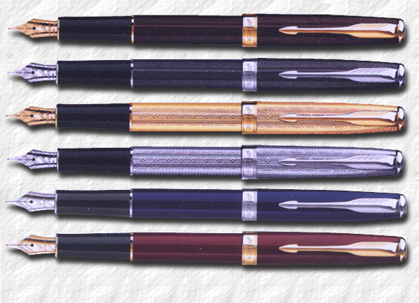
New Sonnets 2008: Chiselled Chocolate, Chiselled Carbon, Gold Lustre, Silver Lustre, Laque Deep Blue and Laque Deep Red. |
| Fougére (1994-2002) Athenes (1994-2000) Dimonite G (1994-2000) 14K Gold plated (Dimonite) (2001-2002) Chinese Laque Vision Foncé (1994-1997) Chinese Laque Ambre (1994-1997) Chinese Laque Red (1998-2002) Indigo Laque (1994-1998) Moonbeam Laque (1994-1998) Firedance Laque (1994-1998) Autumn Red Laque (1994-1997) Forest Green Laque (1994-1997) Midnight Blue Laque (1994-1997) Black Laque GT (1994-) Black Laque CT (2003-) Matte Black GT (1994-) Matte Black CT (2003-) Premier Deep Blue Laque (1998-2002) Premier Green Laque (1998-2002) Premier Red Laque (1998-2002) Deep Blue Laque (1998-2002) Green Laque (1998-2002) Red Laque (1998-2002) |
Sterling Silver Cicelé (1994-) Chiselled Tartan GT (2003-2007) Monochrome Angular (2007) |
 |
The 2010 Dark Grey Laquer Parker Sonnet. |
© 1995-2019 Tony Fischier and The Parker Pen Company®/Sanford Ecriture.
This page is in no way sponsored by or created by the Parker Pen Company®. All opinions, views, and thoughts expressed herein are expressly the authors, and in no way reflect the opinions, views, or thoughts of the Parker Pen Company®/Sanford Ecriture. All logos and/or images on these pages are © Copyright of Parker Pen Company®Sanford Ecritureunless otherwise stated and is reprinted by kind permission. If You feel that Your copyright has been violated please contact the WEBMASTER.
Everything on this website is copyrighted by law and can not be used without written permission from the author, Tony Fischier. You may however use the information as reference material and although it is forbidden to make digital copies or reproductions it may be physically printed for personal use, which does not include use on other web pages or in advertising. You may however quote parts of the content of this website, digitally or physically, providing that the source and author is clearly stated, together with the copyright information. In the US referred to as Fair use. If you use any information on this site, add a link.
Feel free to donate a small sum through Paypal to help this site to stay online. Acknowledgements.
Parkercollector.com in translated versions
